Menu in the Cassiopeia template
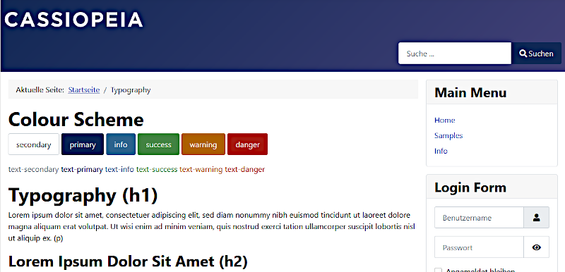
Vertical menu in the right sidebar
After installing Joomla 4, the menu module is located on the module position "sidebar-right" of the Cassiopeia template. The menu items are displayed vertically.

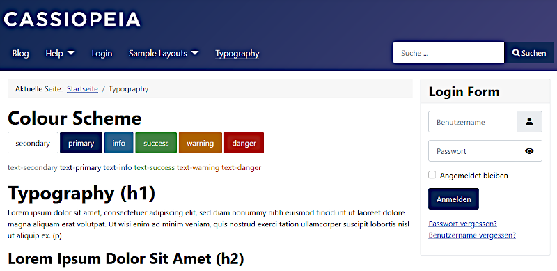
Horizontal menu
Often you want to display the menu horizontally. The module position "menu" is suitable for this. The following adjustments are necessary:
- Go to the menu module in the backend: Content -> Site Modules: "Main Menu"
- Assign the menu module to the module position "menu"!
- Select the "Advanced" tab in the menu module!
- Change the following settings:
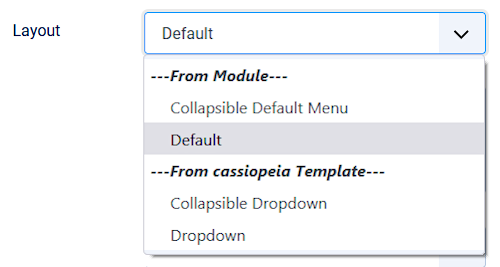
Layout: "Collapsible Dropdown" or "Dropdown" (previously: Default)
Modul Tag: "nav" (previously: div) - Save the menu module!
The menu is now displayed horizontally. If this is not the case, please empty the Joomla and browser cache and refresh your page!
Notes:
Collapsible Dropdown (Cassiopeia):
The menu is shown with submenus. A "Hamburger menu" is displayed on mobile phones.
Dropdown (Cassiopeia):
The menu is shown with submenus. On mobile phones, the menu is displayed vertically.
There are other layout settings. See below "Different layouts for the menu module"!

How to change the display of the menu (css)?
If you want to change the display of the horizontal menu, you can do this via an addition in the user.css, e.g.
.container-header .mod-menu {
   justify-content: center;
   color: #fff;
   padding: 0;
}
You can change the orientation of the menu as follows, for example:
center (Mitte), right (rechts), left (links, standard)
How to change the background color of the entire header (css)?
Often you don't just want to change the background color of the menu, but also the background color of the entire header. You can do this with the following entries:
.container-header {
   background-color: #220e4d;
   background-image: none;
}
It is important to have a background-image: none; in addition to the background color, so that the default background is not used, which is technically an image in Cassiopeia!
By the way: If you use the Hamburger menu (Collapsible) on mobile devices, you can change it with the following entry:
.container-header .navbar-toggler { ... }
Different layouts for the menu module
You can choose between 4 different layouts for the menu module:

Collapsible Default Menu (Module):
The menu is shown without submenus. A "Hamburger menu" is displayed on mobile phones.
Default (Module):
The menu is shown without submenus. On mobile phones, the menu is displayed vertically.
Collapsible Dropdown (Cassiopeia):
The menu is shown with submenus. A "Hamburger menu" is displayed on mobile phones.
Dropdown (Cassiopeia):
The menu is shown with submenus. On mobile phones, the menu is displayed vertically.
Horizontal menu in the footer
If you want to display a menu horizontally in the "footer" module position, assign the "footer" module position to the menu module and make the following settings in the "Advanced" tab:
- Menu Class: menu-horizontal
- Layout: Dropdown
- Module Tag: nav


